This homeowner had regretted the kitchen she’d selected for her home when it was being built and had spoken with her friend and neighbor, kitchen and bath designer Sarah Robertson, about renovating it for years. Because the busy family of four entertained often, the layout just wasn’t working — it lacked pantry space, had a lot of blank space on one wall and included a kitchen desk that seemed like a good idea at the time but wound up never being used. Robertson planned a new layout that made cooking, prepping, cleaning, storing and entertaining a breeze. She also took the style from so-so to sophisticated, pulling together walnut, wood, white, blue, glass, brass and zinc to personalize the space.

After: Robertson replaced the kitchen desk area with a hard-working pantry and fridge wall. “Before, the fridge had been in a spot where it was the first thing you saw when you walked into the room,” she says.
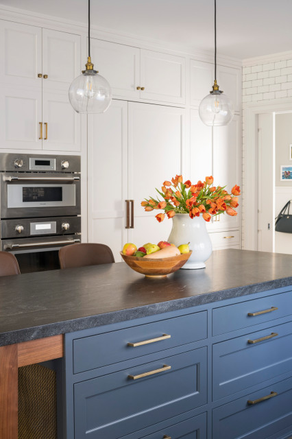
Her friend wanted to keep the kitchen classic like the rest of the home but also infuse it with some personal style. A mix of blue, white and walnut make up the cabinet palette, and Robertson added a few small details inspired by industrial style.
“They have a lot of pale blues and grays throughout the rest of the home and this blue coordinated beautifully with that,” she says. “While it reads more blue in the photos, it has a fair bit of gray in it.” Walnut is another finish seen throughout the house. But Robertson and her client knew that to keep things light they needed to incorporate white, especially on the back wall.
“It can be hard to visualize the mix, so I did 3D renderings of different compositions to get it right,” she says. “I pushed her a bit on the amount of blue, but the renderings let her see the balance.”
The designer guided her client toward these counter stools, which were inspired by the designs of French architect and designer Jean Prouvé. “I loved the style,” Robertson says. “They are robust and add a little midcentury modern and a little industrial style.” A vintage runner adds some color and pattern to the floor and provides a soft place to stand when working at the sink.
Blue cabinet paint: Ocean Floor, Benjamin Moore; white cabinet paint: Calm, Benjamin Moore; Prouvé counter stools: Industry West; rug: Old New House
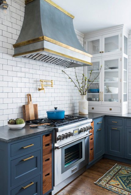
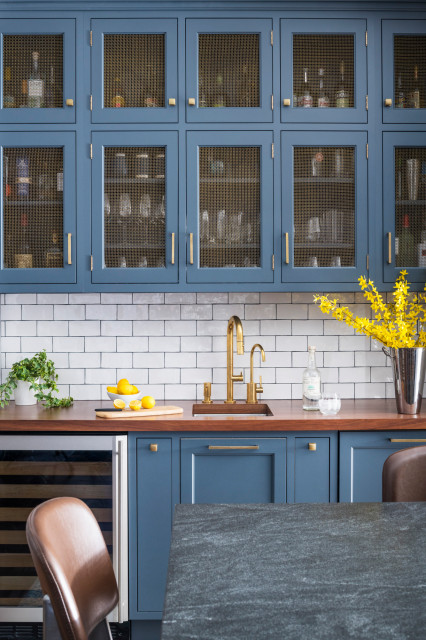
Robertson knew the range hood would have to be a showstopper, and she custom-designed the zinc-and-brass piece. “Because the hood was a major focal point, we went with a ‘background-y’ subway tile around it,” she says. “The dark grout makes it pop a little bit.” It also plays off the subtle industrial feel of the zinc she chose for the hood.
Robertson added sconces on either side of the hood near the ceiling. “I lined up the height of these sconces with that of the sconces I placed over the windows,” she says. “Two different heights would have made for too many different things going on in a kitchen. It was important to have them align.”
Robertson added sconces on either side of the hood near the ceiling. “I lined up the height of these sconces with that of the sconces I placed over the windows,” she says. “Two different heights would have made for too many different things going on in a kitchen. It was important to have them align.”
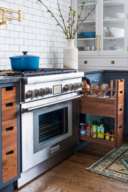
On either side of the range, pullouts keep utensils, oils, vinegars and other cooking supplies handy for the cook. The drawer beneath the countertop cabinet houses all the herbs and spices.
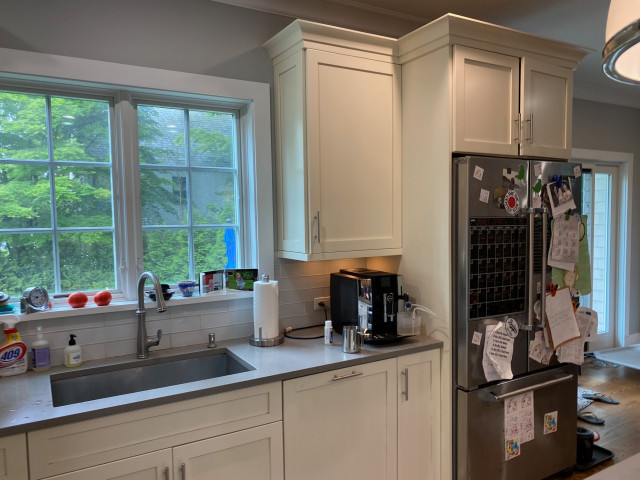
Before: This photo shows the original location of the fridge, opposite the entry to the kitchen.
Although there were windows over the sink, the surrounding cabinets made them feel closed in and blocked natural light from extending into the room.
Although there were windows over the sink, the surrounding cabinets made them feel closed in and blocked natural light from extending into the room.

After: The room’s footprint stayed the same during the remodel. By moving the fridge across the room, Robertson made space for more expansive windows. “We knew we needed to get more light into the kitchen, and with all the new storage on the opposite wall, we had the luxury to double the size of the windows,” she says. She used casement windows, which are easy to crank open when leaning across a counter.
To make the most of the light, she flanked the windows with glass countertop cabinets. “I used glass on three sides of the cabinets so that the light extends through them,” Robertson says. The everyday china and glassware on the right are monochromatic and suitable for display. The designer advised her client to fill the cabinet on the left with lesser-used items like pretty serving bowls and platters, because its location in the corner makes that cabinet a little more awkward to access than the other one.
To make the most of the light, she flanked the windows with glass countertop cabinets. “I used glass on three sides of the cabinets so that the light extends through them,” Robertson says. The everyday china and glassware on the right are monochromatic and suitable for display. The designer advised her client to fill the cabinet on the left with lesser-used items like pretty serving bowls and platters, because its location in the corner makes that cabinet a little more awkward to access than the other one.

The faucet mixes brass with dark graphite on the coil. Robertson custom-specified the finishes through California Faucets. “When I mix metals, I find a common theme and make sure each one repeats somewhere,” she says. The graphite on the faucet picks up on the oil-rubbed bronze on the light fixtures.
The drawers and doors on either side of the sink are facades that seamlessly conceal two dishwashers. “This is a busy family of four who entertain a lot, so they realized they needed two dishwashers,” Robertson says. “I like to double down on adding the hardware and making the false cabinetry look totally legitimate. It makes the dishwashers completely disappear. And having one nice line of drawers across the top of all the cabinets is a game changer.” It’s easy to unload dishes and glassware directly into the glass cabinet on the right.
The drawers and doors on either side of the sink are facades that seamlessly conceal two dishwashers. “This is a busy family of four who entertain a lot, so they realized they needed two dishwashers,” Robertson says. “I like to double down on adding the hardware and making the false cabinetry look totally legitimate. It makes the dishwashers completely disappear. And having one nice line of drawers across the top of all the cabinets is a game changer.” It’s easy to unload dishes and glassware directly into the glass cabinet on the right.
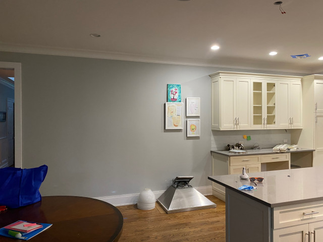
Before: The wall next to the kitchen desk area had remained empty and was wasted space, especially in a kitchen that needed more storage.
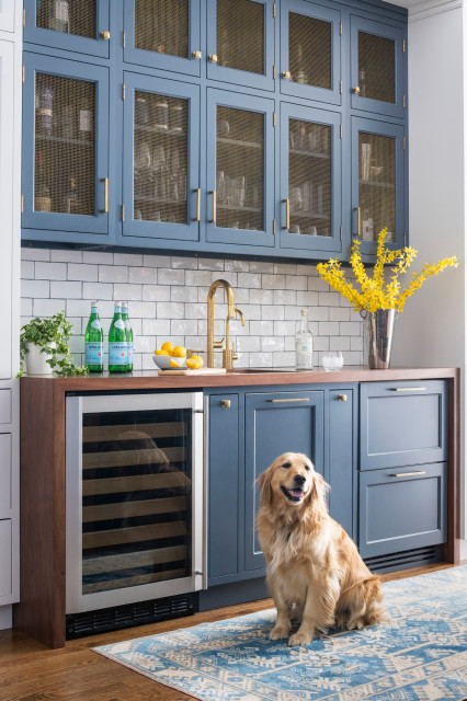
After: “The homeowners entertain a lot, so fitting in a bar was great for them,” Robertson says. The bar serves as a focal point between white cabinets. The fact that it stuck out from the surrounding cabinets presented a design challenge, which Roberston met by wrapping a walnut waterfall countertop around the bar. “This turned it into a really pretty moment that looks intentional,” she says.
This is Chloe, one of the family’s two dogs.
This is Chloe, one of the family’s two dogs.
“My client was really into mesh, which is great because it adds so much texture,” Robertson says. She added brass mesh here on the upper cabinet doors and also on the island. She repeated the brass finish on the faucet, filtered-water spigot and cabinet hardware.
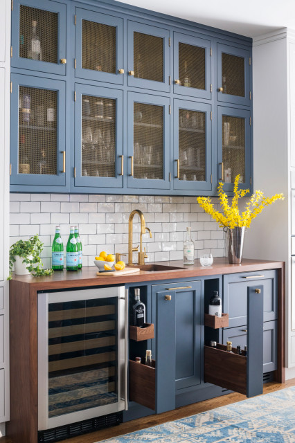
The bar includes a wine cooler, two refrigerator drawers for beverages and pullouts for bottles. Robertson repeated the walnut inside the pullout drawers.
The island and perimeter counters are Jet Mist granite. “I have this in my own house,” Robertson says. “It’s low-maintenance and it goes with everything. And I knew it would work well with the blue we were using in this kitchen.”
The island measures 3½ by 8 feet, providing plenty of storage. This photo shows its walnut and brass mesh details on the left.
The island measures 3½ by 8 feet, providing plenty of storage. This photo shows its walnut and brass mesh details on the left.
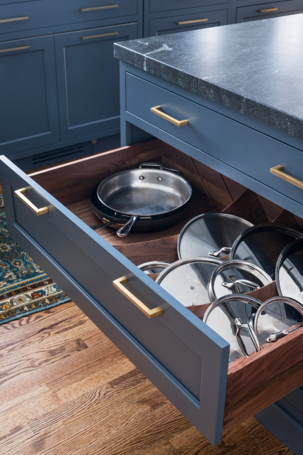
Robertson advised her client to opt for drawers rather than cabinets because they’re more efficient and ergonomic.
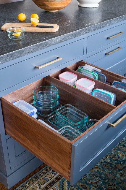
She outfitted them with inserts after taking a careful inventory of everything her clients wanted to store. Slats in this drawer keep food containers and their lids organized.
The kitchen is now set up to handle the get-togethers and parties the homeowners love to have. With their new large island and bar, they’re ready to be even better hosts than they were before.
The kitchen is now set up to handle the get-togethers and parties the homeowners love to have. With their new large island and bar, they’re ready to be even better hosts than they were before.
Courtesy: houzz.com
Kitchen at a Glance
Who lives here: A family of four
Location: Mamaroneck, New York
Size: 238 square feet (22 square meters); 14 by 17 feet
Designer: Sarah Robertson of Studio Dearborn
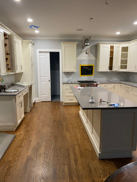
Before: “My client had worked with the builder on this kitchen when they were building this house. So she had some guilt about ripping it all out,” Robertson says. But the longer the homeowners lived with the design, the more they realized it didn’t function well for them. And the kitchen’s lack of style didn’t help, either.
Robertson made sure the existing kitchen didn’t go to waste. She had an organization called Renovation Angel remove the cabinets, countertops, sink, light fixture and appliances for resale and reuse. “This is a great organization,” she says. “They employ people who need jobs and all the profits go to charity. And it eliminates the waste that can result when replacing these things.” The company donates all the proceeds from reselling the items to charities that focus on addiction recovery, at-risk youth, job training and social entrepreneurship.